|
|
|
Dr. Mabuse
Septic Fiend

Sweden
9701 Posts |
 Posted - 08/25/2006 : 14:13:53 Posted - 08/25/2006 : 14:13:53


|
This thread is a continuation of "Surfance of the Sun (part 10)"
The other thread has been locked due to length.
Please continue the discussion...
|
Dr. Mabuse - "When the going gets tough, the tough get Duct-tape..."
Dr. Mabuse whisper.mp3
"Equivocation is not just a job, for a creationist it's a way of life..." Dr. Mabuse
Support American Troops in Iraq:
Send them unarmed civilians for target practice..
Collateralmurder. |
|
|
McQ
Skeptic Friend

USA
258 Posts |
 Posted - 08/25/2006 : 15:58:35 [Permalink] Posted - 08/25/2006 : 15:58:35 [Permalink]


|
| Michael, check your PM's. |
Elvis didn't do no drugs!
--Penn Gillette |
 |
|
|
Michael Mozina
SFN Regular

1647 Posts |
|
|
Michael Mozina
SFN Regular

1647 Posts |
 Posted - 08/27/2006 : 14:29:55 [Permalink] Posted - 08/27/2006 : 14:29:55 [Permalink]


|
| These are before and after (the CME) images. I layed a more detailed grid pattern on top of both images and then put both of them vertically so we can compare layouts in detail. I want to start by suggesting that the vast majority of the features in both images remain in exactly the same relationships to one another. In other words, it's not only the three structures I pointed out that retain their goemetric shapes, it's all of them. |
 |
|
|
furshur
SFN Regular

USA
1536 Posts |
 Posted - 08/27/2006 : 14:35:21 [Permalink] Posted - 08/27/2006 : 14:35:21 [Permalink]


|
So looking at the 2 frames that you posted and looking at the shadows from the surface (based on the way you interpret the images), you are saying that the light source is out of the frame to the east, assuming north is up. Is that correct?
|
If I knew then what I know now then I would know more now than I know. |
 |
|
|
Dave W.
Info Junkie

USA
26037 Posts |
 Posted - 08/27/2006 : 15:17:22 [Permalink] Posted - 08/27/2006 : 15:17:22 [Permalink]


|
When looking at the Sun, the standard convention is that North is up, and West is to the right.
I'd also like to say that when I look at the two images, I see that most of the features have increased in size by hundreds of kilometers. Up, down, left and right, everything seems to have increased in size by at least one pixel, in some cases by several pixels. Both bright and dark areas. How does the solid-surface theory account for that? |
- Dave W. (Private Msg, EMail)
Evidently, I rock!
Why not question something for a change?
Visit Dave's Psoriasis Info, too. |
 |
|
|
furshur
SFN Regular

USA
1536 Posts |
 Posted - 08/27/2006 : 15:35:56 [Permalink] Posted - 08/27/2006 : 15:35:56 [Permalink]


|
| West is to the right???? Then my whole is backwards - good God!!! does that mean up is down and more to the point gas is solid????? |
If I knew then what I know now then I would know more now than I know. |
 |
|
|
Cuneiformist
The Imperfectionist

USA
4955 Posts |
 Posted - 08/27/2006 : 18:28:18 [Permalink] Posted - 08/27/2006 : 18:28:18 [Permalink]


|
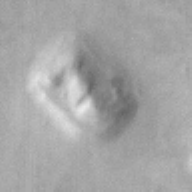
OMG! I just saw this:

Can this be explained? I think it's clear proof from the IMAGES that there was life on Mars. How else can this be explained? |
 |
|
|
Cuneiformist
The Imperfectionist

USA
4955 Posts |
 Posted - 08/27/2006 : 18:37:16 [Permalink] Posted - 08/27/2006 : 18:37:16 [Permalink]


|
quote:
Originally posted by Dave W.
When looking at the Sun, the standard convention is that North is up, and West is to the right.
I'd also like to say that when I look at the two images, I see that most of the features have increased in size by hundreds of kilometers. Up, down, left and right, everything seems to have increased in size by at least one pixel, in some cases by several pixels. Both bright and dark areas. How does the solid-surface theory account for that?
Uh, yeah. If we account for the fact that each pixel represents some ridiculous area-- then the second picture shows tremendous change, no? Not solid at all-- it's clearly liquid or plasma, no? |
 |
|
|
JohnOAS
SFN Regular

Australia
800 Posts |
 Posted - 08/27/2006 : 19:07:13 [Permalink] Posted - 08/27/2006 : 19:07:13 [Permalink]


|
quote:
Originally posted by Cuneiformist
Uh, yeah. If we account for the fact that each pixel represents some ridiculous area-- then the second picture shows tremendous change, no? Not solid at all-- it's clearly liquid or plasma, no?
I agree the changes are huge, but the form or matter isn't necessarily relevant, except if you want to claim that the image directly represents a solid surface.
You argue about the features in these images from Michael's perspective long enough and you forget that they don't necessarily show 3D structure of matter in any form. |
John's just this guy, you know. |
 |
|
|
Michael Mozina
SFN Regular

1647 Posts |
 Posted - 08/27/2006 : 20:53:16 [Permalink] Posted - 08/27/2006 : 20:53:16 [Permalink]


|
quote:
Originally posted by Cuneiformist
OMG! I just saw this:

Actually, that image simply demonstrates that there is a *surface* on Mars. That's why there's a stable "shape" in the image. |
 |
|
|
Michael Mozina
SFN Regular

1647 Posts |
 Posted - 08/27/2006 : 21:02:48 [Permalink] Posted - 08/27/2006 : 21:02:48 [Permalink]


|
quote:
Originally posted by furshur
So looking at the 2 frames that you posted and looking at the shadows from the surface (based on the way you interpret the images), you are saying that the light source is out of the frame to the east, assuming north is up. Is that correct?
Well, not exactly. The light source is the same light source you see in the raw images, namely the coronal loops. They are simply being "subtracted" out of the image for the most part, but you do see their influence on the surface features. Most of the plasma is blowing right to left, and bottom to top. That movement of plasma past a highly metallic surface, helps generate more electrical activity on the "windward" side of the surface features. The "dust" that blows in the wind during the video allows us to see the flow of plasma relative to the rigid features below.
While LMSAL acknowledge the rising and falling material, they fail to note that it originates from the centeral ridge area, and much of it falls back to the surface leaving noticable "groves" from the central ridge where the CME occured, toward Teardrop Hill. You'll notice a series of diagonal line in the bottom image that are not in the top image. If you watch the movie itself, you can see them form as the material that is kicked up in the CME starts to settle back to the surface.
Just to keep things less confusing, let's talk about this image in terms of up, down, right and left rather than compass headings. I think we will all find that less confusing. |
| Edited by - Michael Mozina on 08/27/2006 21:07:02 |
 |
|
|
Michael Mozina
SFN Regular

1647 Posts |
 Posted - 08/27/2006 : 21:06:15 [Permalink] Posted - 08/27/2006 : 21:06:15 [Permalink]


|
quote:
Originally posted by Dave W.
I'd also like to say that when I look at the two images, I see that most of the features have increased in size by hundreds of kilometers. Up, down, left and right, everything seems to have increased in size by at least one pixel, in some cases by several pixels. Both bright and dark areas. How does the solid-surface theory account for that?
The bottom image is simply "brighter" than the top one. Teardrop Hill didn't move out of it's square or change shape in any way, nor did the geometric relationships between these surface features change in any way. |
| Edited by - Michael Mozina on 08/27/2006 21:07:44 |
 |
|
|
pleco
SFN Addict

USA
2998 Posts |
 Posted - 08/27/2006 : 21:15:13 [Permalink] Posted - 08/27/2006 : 21:15:13 [Permalink]


|
quote:
Originally posted by Michael Mozina
quote:
Originally posted by Cuneiformist
OMG! I just saw this:

Actually, that image simply demonstrates that there is a *surface* on Mars. That's why there's a stable "shape" in the image.
But that isn't the point Cune was making. I notice you didn't include the rest of his post in your reply. |
by Filthy
The neo-con methane machine will soon be running at full fart. |
|
 |
|
|
Dave W.
Info Junkie

USA
26037 Posts |
 Posted - 08/27/2006 : 21:22:45 [Permalink] Posted - 08/27/2006 : 21:22:45 [Permalink]


|
quote:
Originally posted by Michael Mozina
The bottom image is simply "brighter" than the top one.
Then why did the dark areas get larger?quote:
Teardrop Hill didn't move out of it's square or change shape in any way, nor did the geometric relationships between these surface features change in any way.
And we know that the time between the two frames is less than 1.5 hours. Why would you expect to see large-scale "geometric" changes in magnetic fields in such a short time?
Not that some such changes don't occur. Here's what you need to explain, Michael:

The above image is a difference image between the two video frames you selected, Michael. Pixels which are darker in the second image than in the first are blue (the brighter the blue, the darker the pixel got), and pixels which are brighter in the second image than in the first are red (the brighter the red, the brighter the pixel got). There is a 2x contrast enhancement applied to make it less muddled.
I actually think it's much more interesting if we filter out the overall brightening of the entire images:
 |
- Dave W. (Private Msg, EMail)
Evidently, I rock!
Why not question something for a change?
Visit Dave's Psoriasis Info, too. |
 |
|
|
Dave W.
Info Junkie

USA
26037 Posts |
|
 |
|
![]()